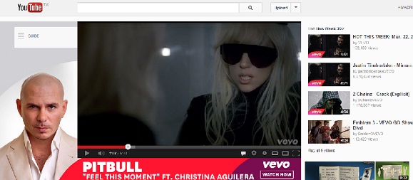
Over the last few years, there has been a gradual but very definite change in people’s viewing habits. When I say this I do not only mean that the way content is streamed and demanded but also the devices on which such content is viewed. Traditional viewing of content has undergone a radical change and this is one of the reasons why YouTube was given a new layout. Apart from the new layout, YouTube also underwent a major change in terms of subscriptions and brand hubs as well.
Research has shown that YouTube has often been watched on screens that are bigger than 30 inches in size. YouTube’s new layout has been designed in such a way that it embraces these new screens and makes the viewing an even more enjoyable experience. Now that we are aware of why YouTube has a new layout, let us look at the impact it has on brands and how it will benefit them.
Before we do this, let us briefly look at the ways in which YouTube has been redesigned. In a nutshell, three areas have been targeted: titles, streamlined design and recommended videos. These changes have been viewing on YouTube even more effective. Let us now see how this is so.
- Easier for Brands to Establish Themselves: In the first place, these changes clearly show a shift in the way browsing on YouTube is being affected. YouTube browsing is looking ahead to platform based browsing and channel browsing, as compared to earlier discovery based browsing. You may wonder how this will affect brands. Quite simply, brands will now find it easier to establish themselves as well as their content on YouTube. Bear in mind that many changes have been made to the homepage. It’s a given that people who follow a particular brand will be able to now see new uploads made by a particular brand more prominently.
- Subscription to More Channels: YouTube has always targeted subscriptions. With all the latest updates, YouTube is definitely hoping that its users will spend more time on its site. Presently, users watch videos on YouTube for a little while and then leave to find more interesting information on other social media sites. By encouraging users to subscribe to more channels, the site will have more videos to show in their feeds. These videos will be either based on recommendations or content from subscriptions. This will encourage users to spend more time on the site and this is another sure fire way that brands will benefit from it, as they will be more exposure.
- More Targeted Traffic: Creators of video content will be pleased with the new layout as it will give their brands more targeted traffic. Even non profit organizations will benefit from this new layout and improved and increased targeted traffic. What’s more is that with traffic being targeted, two other areas will improve as well. These two other areas are the number of videos being watched and the click through rates.
- Tap in Via the Mobile: One definite and improved change where the new YouTube design is scored is the mobile experience. Many YouTube viewers access the site on their mobile phones. The all new changed version is even more beneficial to brands when accessed through a mobile. This is because refreshing the page automatically results in scaling the brand’s layouts to the size of the screen. This in turns results in better viewing enhanced user experience and more importantly, maintains the clarity of the brand in question.
It is still early days to see how much brands benefit by the new look, but one can see that brands who stick with the site are sure to gain rewards in the months to come.


